Friday, 5 November 2010

My Front Cover

Here I have created my final front cover, I have shown the different stages of the process I had to go through:

 
1
Firstly, after editing my chosen photo in iPhoto, I opened the picture in PhotoShop so therefore this enabled me to start creating my front cover.

2
Next, I added my title, "The Word", and edited the font, colour and design so the typography would fit the image and style that I chose. 


3
I edited the title so that it had a shadow behind each letter, I thought that this added to the professional looking image of a School Magazine front cover.

4
This is my final draft of the school magazine front cover, I have used effects on PhotoShop to insert various adverts and texts of interest to the demographic target audience which is students. 

Analysis of my School Magazine Front Cover
After looking back at my final design of the front cover, i feel there could be some improvements, such as, editing the colour scheme as it does not match the whole theme of the magazine. Additionally, from what I know, this type of cover does not look professional and sophisticated. However, the image of the student and the overall typogrpahy based on the Southend High School for Girls colour scheme makes it clear to the audience that this magazine is particualrly aimed at a student reader. The advertisements convey particular codes and conventions of a school magazine, including advice on revision tips and upcoming events.

Tuesday, 2 November 2010

Case Studies for Textual Analysis

1. Case Study: NME - New Musical Express

Background and Ownership

NME was first published 7th March 1952, and from that day onwards has been a popular weekly music magazine. NME was at it's prime in the 1970s as it became the best-selling British music magazine. This magazine is also closely related with the Punk/Rock genre, and to this day still features new and upcoming bands of this particular genre of music. From, the start of the 1990s, NME included more and more Indie/Alternative bands in the magazines.

NME is owned by IPC Media, a company also producing books, newspapers and new technology. NME has a website, created in 1996 supplementing what is displayed in the music magazine. The website is updated weekly presenting news, information and pictures of what you may find in the magazine but also other aspects too. For example, in 2001, to encourage people to visit the website and promote bands, the NME website gave away a free download of "The Strokes" debut single "Last Nite" a week before it was originally released. Not only does this help promote the band as it gives the listener an insight into what their music sounds like, but it encourages music fans to visit this site frequently as there maybe more singles to download, typically of their music taste. Additionally, in 2007, NME TV first hit our screens, producing coverage of the type of bands displayed in the magazine. Similarly, in 2008, NME Radio was first released, broadcasting new Indie/alternative tracks corresponding with the magazine. There is also NME Awards and Tours which feature some of the biggest names in the Indie Music industry.

Reader Profile

The average age of a NME reader is 23, with 65% of readers of the male gender. In May 2008, NME redesigned their magazines, hoping to appeal to a more older, sophisticated audience, losing the "poppy" aspect. It would seem that the readers of NME display a keen interest in fashion as it could be argued that they use their favourite bands/artists as fashion icons. The posters featured in the magazine display full length posters of well-dressed bands, perhaps hoping to influence the readers. Also, the band merchandise displayed in the weekly issues reinforces the love of fashion. Additionally, according to market research, the NME reader regularly downloads new music weekly, the enthusiasm of the readers is displayed in the magazine as it regularly features many dates for gigs, album reviews and gig reviews. Additionally, NME releases special editions for Glastonbury and Reading & Leeds Festivals, as well as having an NME stage at these particular festivals.

Style/Layout/Mode of Address

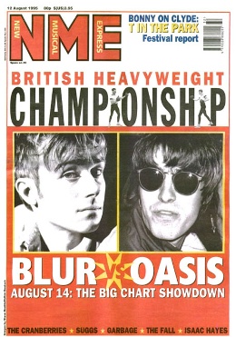
Originally, NME was published in a non-glossy tabloid format on standard newsprint, simliar to a newspaper. For example:
File:Nme blur oasis.jpg
File:New Musical Express cover, 21.02.76 (Patti Smith).jpg

February 1976
                                                                                         August 1996

However, from March 1998, the paper was no longer published on newsprint but it was printed in a tabloid size and possesses a full, glossy front cover which gives a more modern appeal. At this present time the NME costs £2.30 (2010), but over the years the price has risen as it is costing more to publish. This prices is still reasonably cheap as it is catering for the younger generation's finances, often the magazine includes free CD's or posters for the reader to collect. Each week there is a different image displayed on the front cover of the music magazine which generally covers most of the page, a block of text usually supplements this informing the audience of the purpose of this picture. Inside the magazine, there are pages devoted to various bands/artists, dates of gigs and tours, band clothing available to purchase and posters. The posters demonstrate the youth readership.

To display the conventions of Indie/Alternative music, NME features puns in titles relating back to music, for instance, there is a section about "The Drums", and NME refers to them as "the surf-poppers" which evidently relates to one of their songs. This shows the audience that this magazine is purely for dedicated music fans as they would be the readers than understand the pun. There is use of slang and words such as "emo" referring to groups of people, illustrating that the target audience is the late teens as this type of language appeals to that particular age group.

Content and Approach to Music

This magazine is related with less popular Indie music and does not focus on mainstream Pop Music. This is an advantage for small, young, unsigned bands as it helps them promote thereselves. Also, this is another aspect for young, enthuastic, festival "go-er's" as it allows them to keep up to date with the latest music that an average person may not be aware of until a few months later when it is shown on TV. The majority of the content in NME is articles, interviews and tour information on less mainstream Indie/Alternative bands such as, The Drums, Crystal Castles, Arctic Monkeys, Vampire Weekend, British Sea Power, The Cure, Morrissey and many more... Many of which have been supported from the early days of their careers by NME.

Throughout the magazine, the NME magazine directly addresses the audience which engages them to read more and would perhaps make them feel part of the magazine itself. For example, the magazine states "what you thought" and also states "we" in headings. There is a fan page where readers can share their thoughts about recent gig experiences, ask questions and generally give their opinions on music.

Sunday, 17 October 2010

Focus Group Questionnaire

I decided to design a questionnaire for my focus group to gain more information about what types of magazines they read, how often and their interests. My focus group will range between the ages of 16-18 which is the particular ages that the magazine will be aimed at. Additionally, I will show the focus group my flat plan designs of the front cover and this will give me an idea of their opinions and thoughts. Consequently, their feedback will help me in making the front cover successful as it is these students that will potentially be reading the magazine.

Here is a copy of the Questionnaire that I gave out to students to help gain an idea of how many people read the current school magazine, and which features the students like and dislike:

 
Questionnaire for Focus Group

Gender: Male/Female?                 Age: ______

1. Do you attend School/College/Sixth Form/Work/None?
______________________________________________

2. Do you enjoy reading magazines?
a) Yes        b) No

3. If yes, which genre of magazines do you usually read?
a) Fashion    b) Sport    c) Cartoons    d) Music    e) Computers    f) Home    g) Films and TV     h) Other

4. How often do you read entertainment magazine?
a) Never   b) 1-2 times per week   c) 3-4 times per week   d) 5-6 times per week 
e) 7+ times per week

5. Do you read the Sixth Form magazine?
a) Yes    b) No

6. If so, how often do you read it? E.g. weekly/monthly.
_______________________________________________

7. What are your favourite aspects of the Sixth Form magazine at the moment?
__________________________________________________________________________________________________________________________________________________________________

8. What are your least favourite aspects of the Sixth Form magazine at the moment?
__________________________________________________________________________________________________________________________________________________________________

9. Is there anything else that you would like to appear in the Sixth Form magazine?
__________________________________________________________________________________________________________________________________________________________________


Thank you for taking the time and completing this questionnaire!


Results of Questionnaire

After ensuring everybody that completed my questionnaire was between the ages of 16 and 18, I gained these results:

  • The most popular genres of magazine was Fashion and Music, TV and Film was quite popular too. Nobody chose the Home genre which informs me that that type of magazine would be for the older generation.
  • Most students that completed the questionnaire said that they read entertainment magazines 3-4 times per week. This proves that most of the people that were asked enjoy reading magazines if they are interested in the particular subject.
  • Out of the 10 people asked, 6 people said that they read the school magazine at the moment. Hopefully if it includes more subjects that they have an interest in then the numbers will increase.
  • Here are the results for the favourite aspects of the Sixth Form magazine:
 

This pie chart proves that the students would ideally prefer more pictures displayed in the magazine and also more advice and tips.
  • Here are the results for the least favourite aspects of the Sixth Form magazine:
 

This pie chart displays most students feel that the Sixth Form magazine at the moment is related too much with education and should be more focused on the students themselves. I feel if the magazine was related more about the students then more people would have an interest and read it more, ultimately finding it less boring.

  • Here are some ideas for what the students think should appear in the Sixth Form magazine:
- Shorter articles with people of interest

- More Diagrams instead of blocks of text

- More colour

- More pictures

- Articles written by students

- Advertising upcoming events (that are happening in school and around the area)

Sunday, 10 October 2010

Focus Group for Sixth Form Magazine

I asked four different people aged between 16-18 years old various questions about themselves and what types of magazines they enjoy reading. These are the people that I am going to use for my focus group and they will give their thoughts and opinions on my flat plan design for the Sixth Form magazine.


Anna Bradford
Age: 16
Sixth Form/College: SHSG
Subjects Studying: Media, Sociology, Business & Economics and Maths
Favourite Subject: Media Studies
Interests: Music, Tennis and Watersports
Favourite aspect of a Magazine: Celebrity gossip and Fashion 
Least favourite aspect of a Magazine: Fake celebrity gossip
Favourite Magazine(s): LOOK and Grazia
Time spent reading magazines: 1 hour per week


Hayley Occleshaw
Age: 16
Sixth Form/College: Palmers College
Subjects Studying: History, Psychology, Sociology and English Language
Favourite Subject: History
Interests: Dancing and Socialising
Favourite aspect of a Magazine: Advice Columns
Least favourite aspect of a Magazine: Serious news
Favourite Magazine(s): Kerrang
Time spent reading magazines: 1 hour per week


Joe Parker
Age: 16
Sixth Form/College: New Hall Sixth Form
Subjects Studying: Art, English Literature, Psychology and Critical Thinking
Favourite Subject: Art
Interests: Playing Guitar, Art, Socialising
Favourite aspect of a Magazine: Interviews and Articles on people of interest
Least favourite aspect of a Magazine: Excessive adverts
Favourite Magazine(s): Total Guitar, NME, Kerrang, Q
Time spent reading magazines: 1 hour per week


Meg Kelly

Age: 16
Sixth Form/College: SHSG
Subjects Studying: Media Studies, Government and Politics, Product Design and Business Studies
Favourite Subject: Product Design
Interests: Music, Fashion, Films
Favourite aspect of a Magazine: Fashion and Music articles
Least favourite aspect of a Magazine: Too many adverts and not enough content
Favourite Magazine(s): Vogue, LOOK and NME
Time spent reading magazines: 1-2 hours per week

Friday, 8 October 2010

Flat Plan of My Sixth Form Magazine

What is the purpose of a Flat Plan?


The purpose of a Flat Plan is to design your ideas that you would ideally like to appear on the front cover of the Magazine. Flat Plans are really useful as you can see what the magazine will potentially look like and decide what aspects you prefer and also what aspects are your least favourite. Addtionally, creating flatplans enables you to present the front cover to the designated focus group and then they can give their thoughts and opinions about the design before it is created and too late to change it. Before a magazine is actually made, flat plans are essential so each section of the magazine can be put together and can actually be edited, this is a crucial part of the planning. Designing flat plans have helped me choose what the focus group and I preferably want to appear on the front cover and eliminate any other potential ideas so ultimately the magazine can be successful as possible.

Here are two possible flat plan designs of what the cover of the Sixth Form magazine will potentially look like:


Design 1:


Design 2:


In order to help me decide which front cover to choose, I shall show both covers to my focus group and consequently they will give their feedback about which design they will prefer.


Results:

I showed both designs to the four people in my focus group and they gave this feedback:

Anna Bradford: "I prefer design 2 as it appears to include more articles that would be of interest to students attending Sixth Form."

Hayley Occleshaw: "I like design 1 as the different pieces of text are more spread out and it doesn't look as squashed. However, the articles look more interesting on design 2."

Joe Parker: "I think the second design is better as it seems to grab the attention of the audience more than the first design."

Meg Kelly: "I think design 2 would be more successful as I like the style and feel all the other students would also prefer this style as oppose to the first one."

Monday, 27 September 2010

Textual Analysis of Student Magazines

The magazine WEBSITE enables readers to go online and read about the magazine. The website may present more information and pictures not included in the magazine. This is useful if somebody only has access to the internet.
The model of the student uses DIRECT MODE OF ADDRESS which engages the reader persuading them to read inside the magazine.
The "Make money on Campus" piece of text encourages the reader to purchase the magazine as it states "tips you need to know" suggesting it is essential that the student buys the magazine and reads it. It seems very crucial that you take the advice from the magazine.
The ANCHORAGE TEXT links the central image to the topics of the article.
The TITLE BLOCK is a lime green font bringing colour to the magazine which emphasises the brightness of the college. Additionally, the title is "college" suggesting a whole community, making it a friendly environment that people want to be in.
The magazine front cover includes what would seem like a typical student that attends the college. He appears to be happy to be attend this particular college, he is also holding text books which promotes a good learning environment at this particular institution.


The TITLE BLOCK is called "the drama student" immediately informing the reader that this magazine is particularly aimed at students interested and studying drama from age 16 upwards. This tells us that inside the magazine, it will display information and pictures which would be particularly helpful for somebody studying drama.
The model or student uses DIRECT MODE OF ADDRESS capturing the readers attention attracting them to purchase the magazine, additionally it quotes "Rising Stars" implying that the model is a young actress. This intrigues the reader as the young actress could be an idol, this could be the reader's dream so featuring a star on the front cover is inspiring for the audience.
Using words such as "exclusive" draws the reader's attention in as they get an impression that the information inside the magazine cannot be found anywhere else.


The TITLE BLOCK is "the National Student Magazine" telling the audience it is aimed at all students everywhere. "Magazine" is written in a more informal type of font which suggests a casual atmosphere which would grab the student's attention immediately.
The image features the popular British indie/alternative band "The Kooks", which immediately draws the fans of this particular band in as they are given the impression that this magazine clearly contains some sort of information associated with "The Kooks". In supplement to this, students that like music of  the indie genre quite probably would decide to purchase this magazine and be interested in it. The lead singer uses DIRECT MODE OF ADDRESS to make it look like he is looking at the reader inviting them to read the magazine, the audience then feel included in the magazine.
At the bottom of the magazine, it displays words such as "TV", "Music", "Films" and more presenting to the reader that this magazine features are aspects of the arts industry as well as music of the indie genre. Most students enjoy at least one of these aspects of the arts industry supporting the title "The National Student Magazine" clearly informing everyone that it is aimed at all students.
The front cover does not have much writing, the image covers most of the page, it seems like this has been purposely done so it intrigues the reader to purchase the magazine if they are interested in a topic covered which is highly likely and consequently they open the magazine and read it.

My Own Sixth Form Magazine Pictures

 Prospectus Pictures


Although this picture would be particularly suited to a Sixth Form prospectus, I feel it is not appropriate as the student is not using direct mode of address by looking straight at the camera. This technique always helps capture the reader's attention making them want to read more. However, I believe this picture would be well suited inside the Prospectus instead of the front cover. This is because it shows the facilities of the school, e.g. the camera and surroundings, as well as the student studying.


I particularly like this picture as the student uses direct mode of address capturing the audience's attention. I also positioned him to the right slightly so he is not the centre of the magazine to give a more unusual image. However, I am quite disappointed with the light in this picture as it is evident that the flash reflects off of the windows. This is unfortunate, but perhaps it could be edited to adapt the light settings.


This picture seems ideal for a Prospectus as it would seem as if it would impress parents viewing it. It demonstrates a student in a good learning environment and also the student is reading which proves motivation for learning, consequently, this persuades the parents reading the Prospectus to send their son/daughter there.


Sixth Form Magazine Front Cover Pictures


These pictures present a more relaxed feel which would be suitable for a student magazine,   it shows the students taking part in a hobby, in both of these cases photography, also studious, but has a friendlier, more informal side to the picture as oppose to the previous pictures. Both pictures are potential covers for the student magazine.


I particularly like this picture as it demonstrates the student studying in a relaxed environment and he seems as if he is "having fun" because he has a smile on his face. This makes the reader automatically want to know more encouraging them to read inside
the magazine. Additionally, this picture has a casual and informal approach which is directed at the student age range. Unfortunately, the lighting is very dark. This could be solved by changing the camera settings or switching the flash on. Also, it could be dark because the picture has been taken underneath a tree.

As I particularly liked this picture I decided to edit the image. I cropped the image so that the main focus is the student without the background distracting the viewer's eye away from the main subject. Additionally, I used the tool to make it appear brighter as the original image is quite dark and does not give the image a happier vibe. I am considering using this particular image for my front cover.


Here is another example of a potential Sixth Form magazine cover as it demonstrates to the audience that the student is working in a relaxed environment along with her peers. This grabs the student's attention that could potentially purchase the magazine as it shows the girl enjoying learning. This presents a positive atmosphere and learning environment.