Monday 27 September 2010

Textual Analysis of Student Magazines

The magazine WEBSITE enables readers to go online and read about the magazine. The website may present more information and pictures not included in the magazine. This is useful if somebody only has access to the internet.
The model of the student uses DIRECT MODE OF ADDRESS which engages the reader persuading them to read inside the magazine.
The "Make money on Campus" piece of text encourages the reader to purchase the magazine as it states "tips you need to know" suggesting it is essential that the student buys the magazine and reads it. It seems very crucial that you take the advice from the magazine.
The ANCHORAGE TEXT links the central image to the topics of the article.
The TITLE BLOCK is a lime green font bringing colour to the magazine which emphasises the brightness of the college. Additionally, the title is "college" suggesting a whole community, making it a friendly environment that people want to be in.
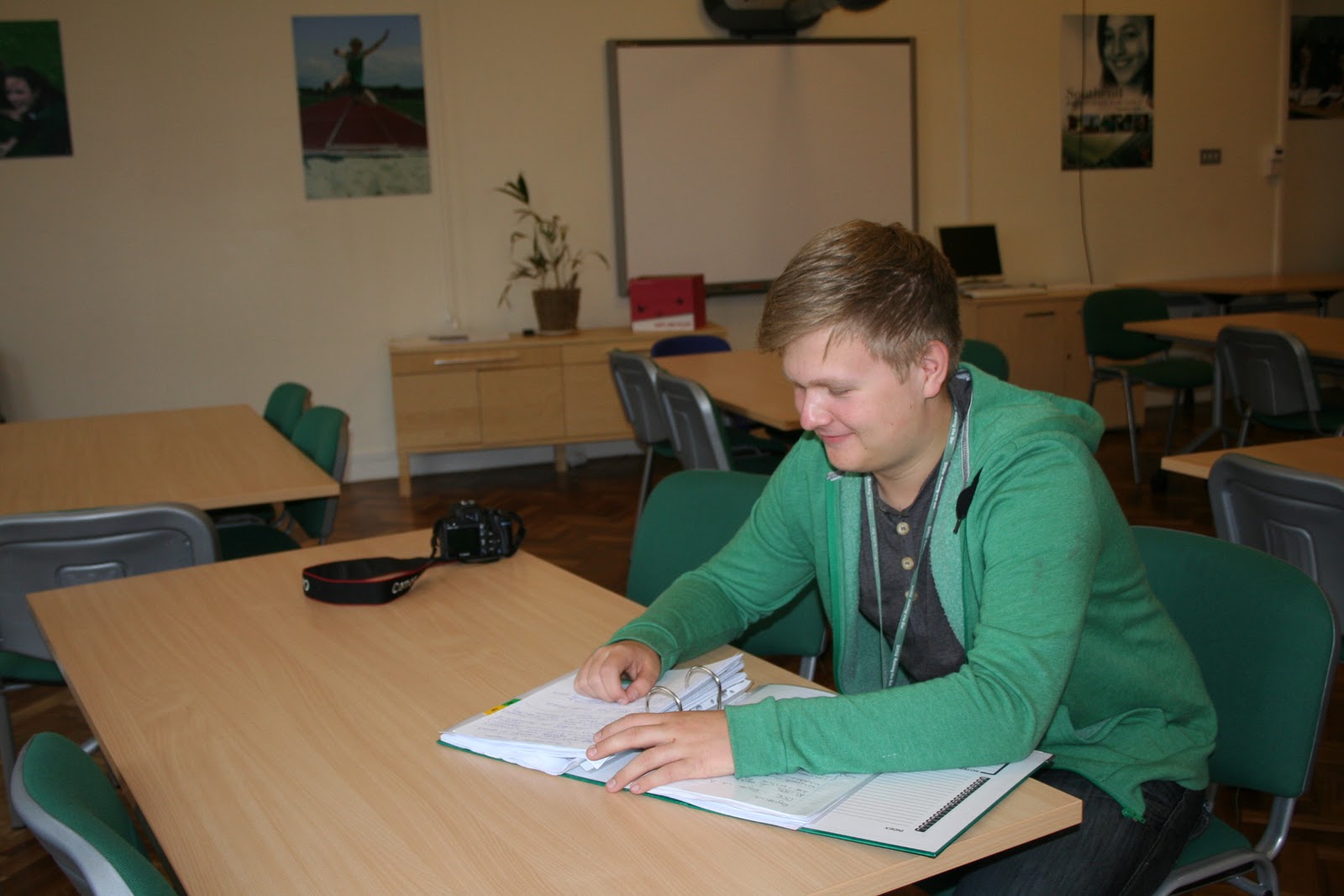
The magazine front cover includes what would seem like a typical student that attends the college. He appears to be happy to be attend this particular college, he is also holding text books which promotes a good learning environment at this particular institution.


The TITLE BLOCK is called "the drama student" immediately informing the reader that this magazine is particularly aimed at students interested and studying drama from age 16 upwards. This tells us that inside the magazine, it will display information and pictures which would be particularly helpful for somebody studying drama.
The model or student uses DIRECT MODE OF ADDRESS capturing the readers attention attracting them to purchase the magazine, additionally it quotes "Rising Stars" implying that the model is a young actress. This intrigues the reader as the young actress could be an idol, this could be the reader's dream so featuring a star on the front cover is inspiring for the audience.
Using words such as "exclusive" draws the reader's attention in as they get an impression that the information inside the magazine cannot be found anywhere else.


The TITLE BLOCK is "the National Student Magazine" telling the audience it is aimed at all students everywhere. "Magazine" is written in a more informal type of font which suggests a casual atmosphere which would grab the student's attention immediately.
The image features the popular British indie/alternative band "The Kooks", which immediately draws the fans of this particular band in as they are given the impression that this magazine clearly contains some sort of information associated with "The Kooks". In supplement to this, students that like music of  the indie genre quite probably would decide to purchase this magazine and be interested in it. The lead singer uses DIRECT MODE OF ADDRESS to make it look like he is looking at the reader inviting them to read the magazine, the audience then feel included in the magazine.
At the bottom of the magazine, it displays words such as "TV", "Music", "Films" and more presenting to the reader that this magazine features are aspects of the arts industry as well as music of the indie genre. Most students enjoy at least one of these aspects of the arts industry supporting the title "The National Student Magazine" clearly informing everyone that it is aimed at all students.
The front cover does not have much writing, the image covers most of the page, it seems like this has been purposely done so it intrigues the reader to purchase the magazine if they are interested in a topic covered which is highly likely and consequently they open the magazine and read it.

My Own Sixth Form Magazine Pictures

 Prospectus Pictures


Although this picture would be particularly suited to a Sixth Form prospectus, I feel it is not appropriate as the student is not using direct mode of address by looking straight at the camera. This technique always helps capture the reader's attention making them want to read more. However, I believe this picture would be well suited inside the Prospectus instead of the front cover. This is because it shows the facilities of the school, e.g. the camera and surroundings, as well as the student studying.


I particularly like this picture as the student uses direct mode of address capturing the audience's attention. I also positioned him to the right slightly so he is not the centre of the magazine to give a more unusual image. However, I am quite disappointed with the light in this picture as it is evident that the flash reflects off of the windows. This is unfortunate, but perhaps it could be edited to adapt the light settings.


This picture seems ideal for a Prospectus as it would seem as if it would impress parents viewing it. It demonstrates a student in a good learning environment and also the student is reading which proves motivation for learning, consequently, this persuades the parents reading the Prospectus to send their son/daughter there.


Sixth Form Magazine Front Cover Pictures


These pictures present a more relaxed feel which would be suitable for a student magazine,   it shows the students taking part in a hobby, in both of these cases photography, also studious, but has a friendlier, more informal side to the picture as oppose to the previous pictures. Both pictures are potential covers for the student magazine.


I particularly like this picture as it demonstrates the student studying in a relaxed environment and he seems as if he is "having fun" because he has a smile on his face. This makes the reader automatically want to know more encouraging them to read inside
the magazine. Additionally, this picture has a casual and informal approach which is directed at the student age range. Unfortunately, the lighting is very dark. This could be solved by changing the camera settings or switching the flash on. Also, it could be dark because the picture has been taken underneath a tree.

As I particularly liked this picture I decided to edit the image. I cropped the image so that the main focus is the student without the background distracting the viewer's eye away from the main subject. Additionally, I used the tool to make it appear brighter as the original image is quite dark and does not give the image a happier vibe. I am considering using this particular image for my front cover.


Here is another example of a potential Sixth Form magazine cover as it demonstrates to the audience that the student is working in a relaxed environment along with her peers. This grabs the student's attention that could potentially purchase the magazine as it shows the girl enjoying learning. This presents a positive atmosphere and learning environment.